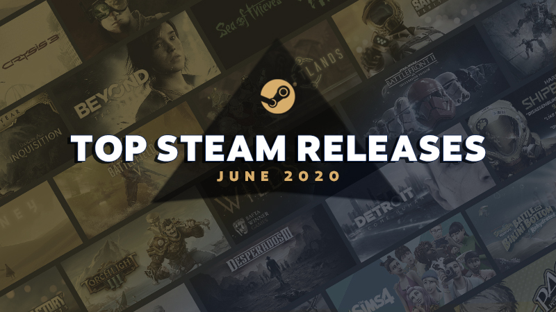
Steam just released a list of the top games of June (lets look at the best of May too).
I like looking at these lists. First, it kind of gives you a feel for what the Steam audience is looking for. Second, looking at all the capsule art is a good way to get a feel for what the current marketing trends are.
Steam exposes your capsule to hundreds of thousands of people but if your capsule is bad nobody is going to click on your game and all that exposure is wasted. Similarly genre is very very important to your audience. You want them to know what your game’s genre is even before they click onto your page.
I think dollar for dollar capsule art is the best use of your marketing money. Also, unless you are an illustrator, DON’T MAKE YOUR OWN CAPSULE ART. Even if you are a small time indie, save up for it.
Now just because your capsule art is awesome doesn’t mean you are going to be a top seller. You still have to make a great game. But these top sellers are likely to be played by people who like your games. So you must be familiar with what the top games in your genre look like so that you can use the same symbols in your own art.
Lets look at 5 trends I saw in May and June’s top sellers.
Trend #1 Crafting & Tools
One of the best examples of knowing your genre’s tropes is the crafting game genre. Look at these top selling builder / crafting games. Notice, you better have a hammer in your capsule art. Crafting Idle Clicker even doubled down on it by adding two hammers.
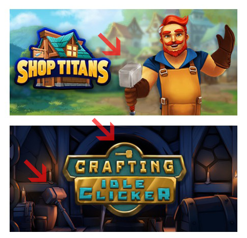
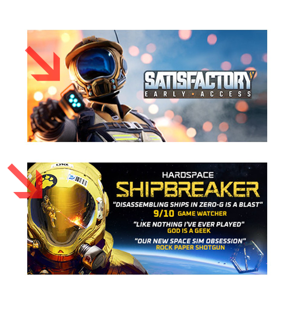
Sci-fi crafting games are big too but a hammer kinda looks out of place. So what do you do? Show a ray-gun tool which is kinda like a space hammer. It is a little hard to see it in Shipbreaker but it is visible in the guy’s helmet. Also, obviously, you must have a big yellow helmet looking straight in the camera. Also your title must be in some version of Eurostile Futuristic
Trend #2 Spaceship Ass
Both of these games are spaceship building simulators – requirement here: have thrusters on full.
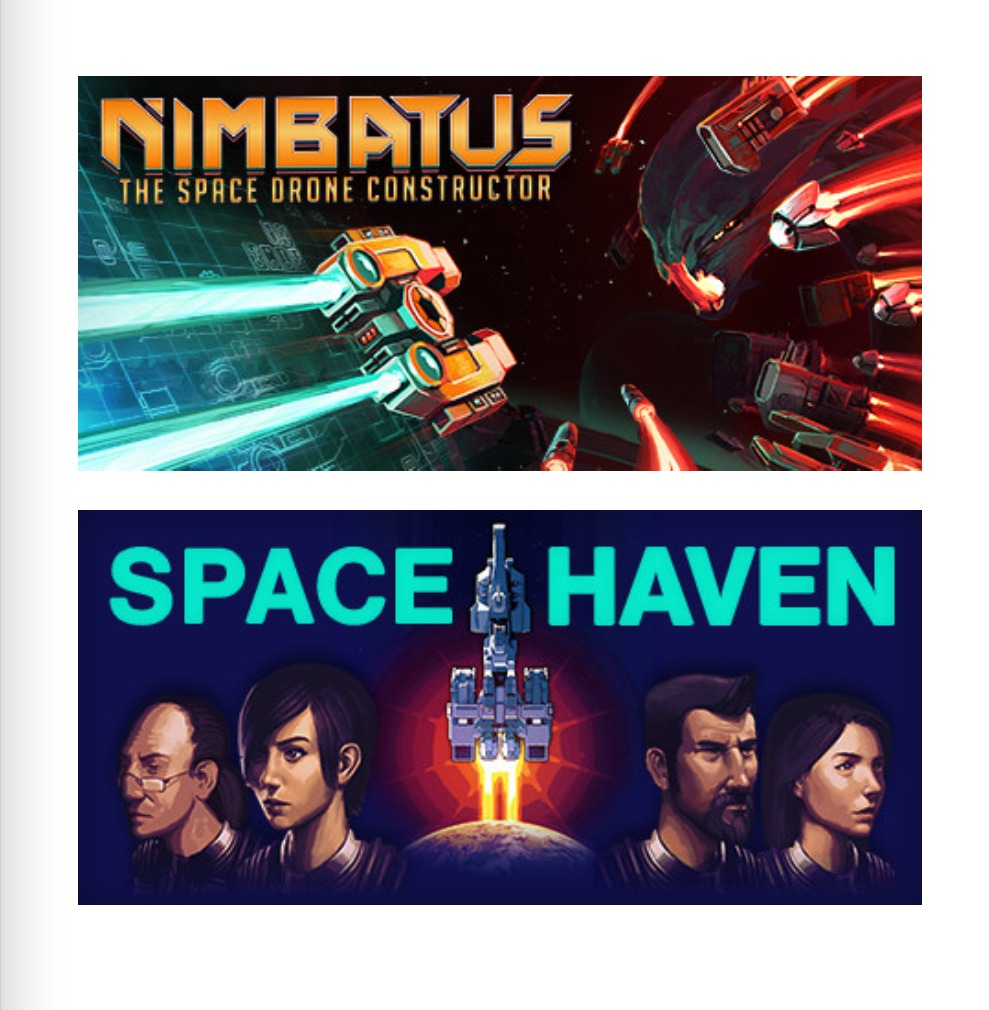
In the business of military sci-fi novels you must show the ship’s afterburners on your book cover. It is so important that authors have nicknamed it “spaceship ass.” So if you are making a spaceship building game, you better show that Stern.
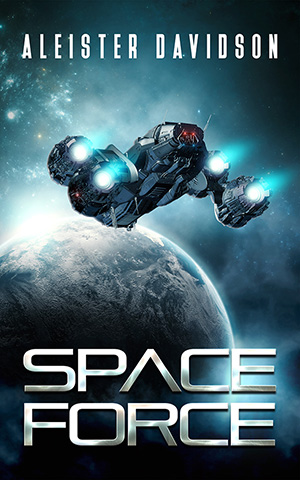
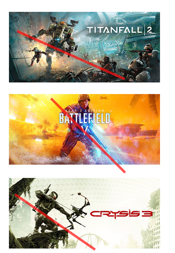
Trend #3 Slanty shooty men.
I noticed a new trend among shooters. Full-bodied shots of the protagonist but with a strong diagonal element to them. Red lines added for emphasis.
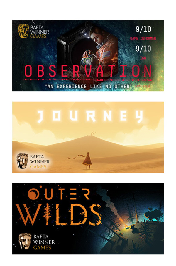
Trend #4 Judging BAFTA Man
Not sure if it is a requirement from the British Academy but apparently if you win a BAFTA you have to put that little face in the left-hand corner of your capsule like he is emotionlessly judging the scene inside your capsule (does he does have a “hmph, is that all there is” smirk to him or is it just me?)
Trend #5 Top colors of the season
I Arranged all the May and June capsules on a rainbow:
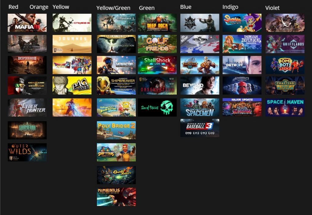
I am noticing a bunch of pastel, goldenrod yellow like an Easter Dress. See Journey, Battlefield V, and Persona.
I also see a particular trend of gradients consisting of a left side yellow transitioning to a sea green on the right. See Titanfall 2, Dragon age, Satisfactory, and Shipbreakers.
Wait I thought I had to be unique?
People look at your capsule art they have a nanosecond to evaluate it. The primary job of it is to catch the eye of people who like your genre. You want to be crystal clear to people who are predisposed to like your game.
Your trailer, and store page copy will tell them what is unique about your game. The capsule is there to tell them what the game is about.
How to use this:
When you are commissioning a capsule, send examples of the top games in your genre to your artist. Point out the similarities you see and tell them specifically to include them. If you are making a crafting game you better tell them to include a hammer. If you can, try to hire artists who have already made capsules in the genre of your game. They will probably understand the symbology better than anyone.