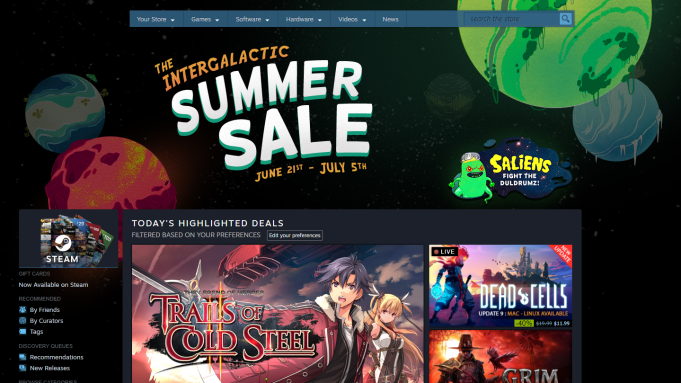
If you have a game on Steam you probably got the notification that the Summer Sale is just around the corner. The Summer and Winter sales drive the most post-launch purchases of your game. Great! Is your page ready for all this traffic? If you haven’t touched your page in over 6 months, it is time for an update.
Even if your page was perfect a few months ago, Valve is constantly adding new Steam features and tags and your page is probably not taking full advantage of them.
When I was doing my Steam Behavior Research I noticed that a lot of people looked at their wishlist and said “hu? What is this game again?” Most folks forget why they added your game and even what it is. When millions of players get that “an item on your wishlist is on sale” email they will be checking out your game with fresh eyes. If your store page hasn’t been updated in a while, it will look like a “dead game” and Summer shoppers will walk on by.
Let’s fix that. I put together a quick guide on the 10 things you need to do to get your Steam game ready for the Summer Sale.
Special note: Because you are a regular reader of my stuff and the Steam sale is almost here I am doing a special temporary offer: a Steam page makeover service. Basically I review your Steam page and do everything I would recommend here plus a couple other super advanced things that would take a whole second blog to cover.
Cost for the makeover is $200 (or $350 for 2 games). This offer is good from now until June 15th. If you are interested fill out this form and I will be in touch.
10 things to get your store page ready for the Steam Summer Sale
1. fix your “user tags”
Go look at your game’s steam page right now. Does your page have the “indie” tag? How about “action” or “adventure.” Now scroll down to your game’s “more like this” section. Is it just a random selection of games from all different genres? if so, that indicates that steam doesn’t know what type of game you have and you need to clean up your tags.
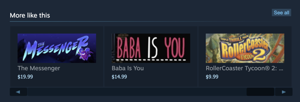
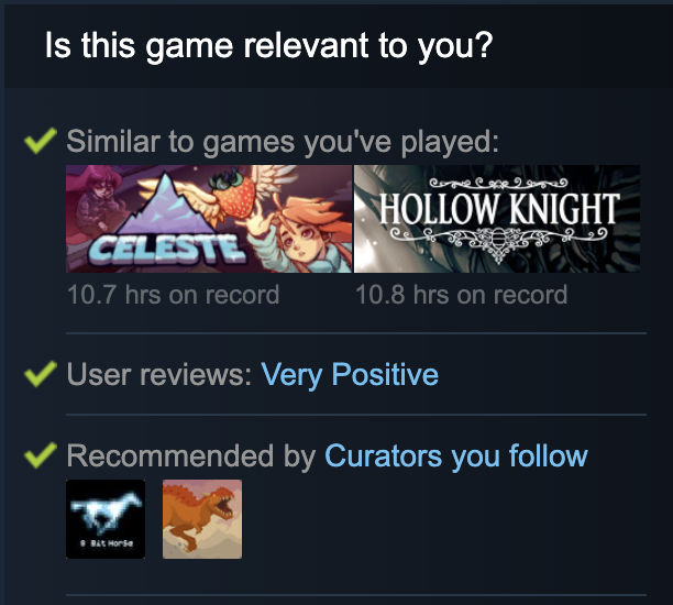
Tags are the most important update you can make to your page because they are pretty much the only way to tell Valve what type of game you have so that the algorithm can show it to the right people. Tags define that “more like this” section. Tags help your game appear here in the “Is this game relevant to you?” section. Tags can get you noticed for consideration special genre sales like “best tower defense games.”
Shoppers also look at your top 5 tags to see if your game is in a genre they like (or don’t like)
A good tag profile should be specific and accurate. If your game’s top 5 tags are too generic like “Action, Adventure, RPG” you are competing against nearly 50% of the games on Steam. But if you define very specific tags like “Tactical RPG, Horror, Typing” you are going to appear in searches for players who are out there with those specific tastes. Your game will also be more likely to appear in “more like this” section for other games.
But your tags also must be accurate. If you tag your game rogue-like and your game does not address the tropes of the genre then you will get bad reviews from players who feel tricked.
So go in, update your tags, and make sure your top 5 are very specific to your game.
For more information on tagging see this documentation from Valve.
2. Rewrite your short description
Shoppers use short descriptions to understand how your game plays. It must answer “so what do you do in your game?” Describe the key actions the player takes and how it controls. List the key hook that distinguishes your game from the rest.
Avoid excessive descriptions of setting, mood, plot, or story. Shoppers get setting and mood from your screenshots and trailer. Shoppers skim past lore (even if you have a story-based game). They just want to know “how do I play your game?”
For more tips on how to describe your game see this post I did on learning how to describe your game to strangers.
3. Add supported features
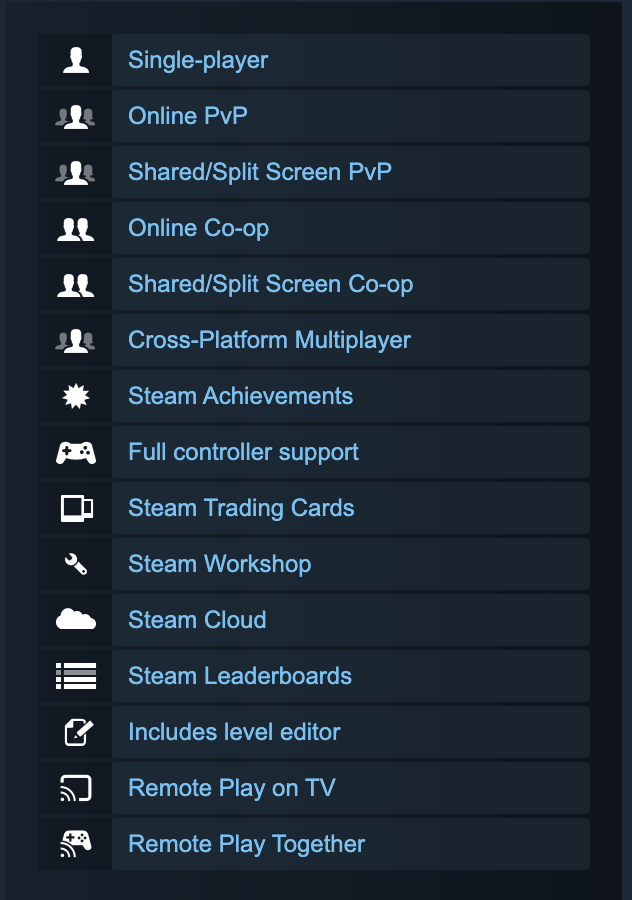
In the time since you released your game, did you add any new features like leaderboards or remote play together or even developer commentary? If so go in and add those so that you get all these great icons that make your game look like it is packed with value.
4. Clean up your graphical assets
Screenshots are one of the key ways that players understand what type of game you have. You communicate that through UI and camera angles. For instance, if you have a visual novel, you better include a screenshot of characters and the dialog choices. If you are making a survival crafting game, you better include a screenshot of that crafting/inventory menu.
Remove excessive trailers. I know you spent a lot of time and money making a teaser trailer, then a gameplay trailer, then a final launch trailer so why not put all of them in the store page? Shoppers prefer to view screenshots first because they are faster to click through and grock the gameplay and style of the game. If your carousel is loaded up with trailers that is a whole bunch of clicking that players have to do on very tiny ui elements to see screenshots. It sounds harsh but I would remove all but 1 really good gameplay trailer.
Look at this game. That is too many videos:
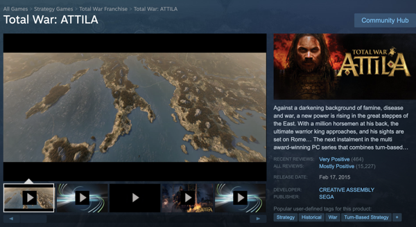
Here is how people look at all your trailers and videos:
5. Rearrange your screenshots
When browsing the main Steam page, shoppers hover their mouse over your capsule image to make this hover tooltip appear.
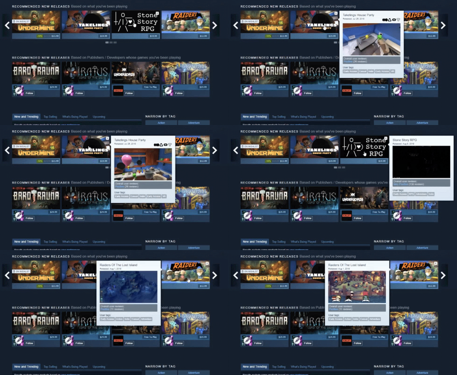
This tooltip cycles among your first 4 screenshots. If shoppers like what they see they click through to your game page. Therefore your first 4 screenshots are super important!
Don’t waste them with 4 images that look almost the same. Instead, show 4 distinct aspects of your game. Include a super attractive image but also include some that show the unique aspects of your game. They should explain what you do in the game. Make sure at least one show UI that clarifies the genre of your game.
6. Clean up your trailer
Go watch the first video on your Steam page. Are the first 5-15 seconds your studio’s logo and game title? If so, cut it.
Is there a big cinematic? Cut that too.
Is there a slow establishing shot of your game’s environment? Cut that.
When it comes to your Steam gameplay trailer, it should just be gameplay. They might like a long cinematic build up on Youtube, but shoppers on Steam want to see gameplay right away. Similarly, Steam automatically generates micro trailers based on your videos. You don’t get to pick what content is sampled so a poorly optimized trailer might get cut down to cinematics, logos, and full-screen text which isn’t great.
For more on this read this great piece by trailer editing master Derek Lieu.
7. Answer negative reviews… nicely
We developers hate them, but shoppers really do use negative reviews in deciding whether they buy. Thankfully shoppers don’t care about the number of negative reviews or instantly hate your game because of them. Instead, they read negative reviews to see if people are complaining about things that actually matter to them. For example, if someone prefers to play FPS with inverted mouse control and they see a bunch of negative reviews about how the game does not support it, they will pass on your game.
If you have patched your game to solve some of the issues mentioned in early negative reviewers, you should respond to them. Leave a brief, friendly developer response thanking the negative reviewer for their input and let them know it has been fixed. First, you might be able to turn that negative review into a positive one. But secondly, you definitely will prevent shoppers from getting turned away from that out-of-date negative review.
8. Pick a price that will get attention.
The big seasonal sales are feeding frenzies where shoppers get a bit trigger happy and start buying things they wouldn’t normally just because they don’t want to miss out on a deal that is that good. This is fear of missing out or FOMO. You want to ride this wave by making sure your prices during the seasonal sales are actually something amazing. Check your game on Steam DB or gg.deals and find out what the lowest price your game has ever had. Steam sales are a great time to push a new “historical low” because of FOMO. Many shoppers check these sites during a storewide sale. gg.deals even has a search tool to list and rank all “historical lows”.
Side note, historical lows are calculated by price point not the percentage off.
9. Don’t look like a “dead game”
If you look at your Steam page, you will see that your last 2 events and announcements appear front and center. If they were from a while ago, they can look a little embarrassing. For instance look at this Steam page for Serious Sam 3.
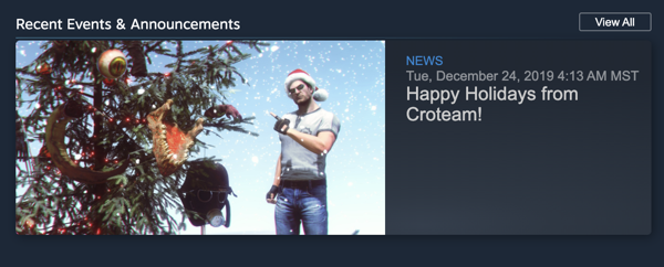
It still has an announcement wishing everyone Happy Holidays. If that is still up during the Summer sale what are shoppers going to think?
Post a couple of announcements to your game well before the Summer Sale starts. You want your game to look active. No updates or an empty forum make your game look like it has been abandoned. Some shoppers don’t want to invest in a game that will not be supported.
Here is a suggestion: the Love Indies event is starting the first week of June (Read more about it here.) Publish an announcement then for the event and then publish another announcement on the day of the sale. There are two updates that will push those old posts off the front page.
10. Summer capsule image
Trying a new capsule image or putting a summer overlay on it gives the message that your game is regularly being updated and worth the purchase. Consider putting some sunglasses on the main character or a sun in the corner. Instant Summer.
Good luck preparing for the Summer Sale. I hope your game looks great on launch day.
If you do need help with your page, you can find my refresh consulting offer here.