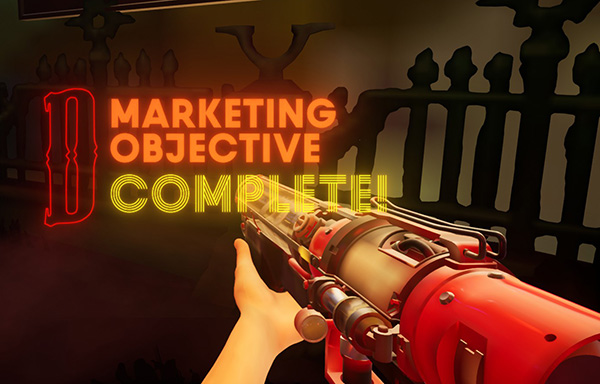
On Saturday, Devolver launched a free game that simulates being in an E3-like expo hall during a dystopian nightmare. The game was released as part of the annual Devolver Direct online showcase of their upcoming games such as Disc Room, Shadow Warrior 3, Fall Guys, Carrion, Blightbound, Serious Sam 4, Olija, and Weird West.
The playable advertisement is described as a “first-person marketing simulator” with really great graphics where you can creep around abandoned booths, watch trailers, and shoot a t-shirt gun at patrolling security bots.
Side note the steam tags are Action, Adventure, Gore. All proper marketing involves gore!
It is a really interesting bit of marketing that fits right in with the latest trend of playable demos.
If you are a small indie with 0-2 games released, you might think “well Devolver knows what they are doing. Their games are popular. We should also make a second game that is a playable advertisement for our other game.”
DON’T DO THAT.
This is something that only a big big publisher like Devolver can do. They are the #1 indie publisher, and in surveys I have performed, their name recognition sometimes outranks developers like Blizzard. I have been to conferences where Devolver rented out an entire club and had an open bar. Now that we don’t have physical events, they have that alcohol money sloshing around to dump on something like this. They likely spent multiple $10Ks on this thing.
Instead, focus on finishing your game. That is the most important thing.
Even if you can’t produce a game to advertise your other games, there are some things you can learn from Devolverland Expo that you can apply to your own game marketing. I want to explore them in today’s column.
#1 Your marketing should be simulating how you play your game
When I was advising the Kitfox team on their Boyfriend Dungeon email marketing strategy, I told them they should make their newsletter into love letters from the different date-able weapons. The big draw of the game is interacting with the characters. So if fans can’t play the game yet, the next best thing is chatting with them via email. (I wrote about the strategy here)
Similarly, some of the games in the upcoming Devolver catalog are very evocative. The Devolverland Expo did a great job making you feel like you were exploring that world. The Carrion booth is gross and alien, the Shadow Warrior 3 booth was beautiful and verdant, and the Fall Guy booth was whimsical and goofy. The game did a great job letting us “experience” the feeling of the games before we could actually play them.
Figure out ways that you can bring your potential customers into your game’s world. Give them experiences that feel like they are playing the game even if they can’t yet because it isn’t done yet. Good examples are soundtracks, graphic novels, short stories, desktop backgrounds, developer commentary, or mini interactive fiction games. Be creative.
Most people say they hate doing marketing because they think it is yelling “buy my game” at every passerby like a sleazy used car salesman. But that is not productive. Nobody will sign up to your mailing list or follow you on twitter. Good marketing means you have to create an adventure that people want to follow you for.
Devolverland Expo did this successfully. The game currently has 3177 Positive reviews for what is essentially an infomercial. How many positive reviews have you seen for an infomercial? If you do it right, your fans will will want to hear from you. That was my thesis from my first GDC talk which you can watch here.
#2 Reduce friction for people trying to engage in your marketing
People have a very, very short attention span especially if it is digital marketing where anyone is one swipe away from a new tweet, browser tab, or youtube video. You have to make the path down the funnel as smooth as possible. Cut out as many clicks as possible to get people from your sales pitch to the action you want them to take.
“Friction” was the biggest problem I saw in the Devolverland Expo. Here is what I mean.
- The game is 7 gigabytes. The download took me a while. Only Devolver can pull this off. If you are a small team nobody knows about, people are going to give up when they see they have to wait for 7 gigs of marketing to download. The internet is so distracting that I am more likely to forget about this thing rather than come back when the download is done. In fact while I was waiting for the game to download, I discovered Apple has an FMV texas hold em game. Look at this this thing it looks so terrifically awkward and it is from Apple!
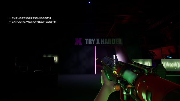
- There were a LOT of patrolling security bots. Like a ridiculous amount. If the bots caught you, you would instantly warp back to the last booth you explored. You couldn’t kill them. The best you could do was stun them with your t shirt gun. And when stunned they blocked the hallways so you couldn’t get around them. Also that damn laser section was so hard to navigate because your hit box was huge. There were several times I would have quit playing the “Expo” if I weren’t writing a column about it.
- There was no progress save so once I beat the game I was back to the title screen. I couldn’t go back and explore in “free range mode” where I could really explore without any pressure. Why would you want to restrict people from your marketing!? Either have an option to turn on “no kill mode” or after beating it have a “free range mode” where there were no bots or locked doors.
- Also my 10-year-old PC just doesn’t quite keep up. I had to set all graphic settings on low. Now I know they are a PC indie company targeting the hard core. But games like Diskroom, Olija, and Carrion aren’t that graphic intensive. So this marketing would be lost on anyone on a lower-end rig. Look at what the Devolver logo looks like because my PC is not great.
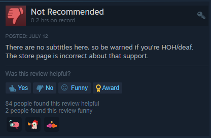
- The worst offense for this “friction” is that Devolverland Expo isn’t an accessible game. Look at this review asking for support for the hard of hearing. Have sub titles!
- Also most of the negative reviews are people complaining about motion blur which really hurts peoples eyes who suffer from motion sickness.
You must make sure your marketing takes people from the top of the funnel to the bottom as smoothly as possible. All these little hitches will cause people to “leak” out of your funnel. Patch them.
#3 Look for partners who are bigger than you
While exploring the game I found a Nvidia booth! You could actually walk up and watch a little video and listen to someone talk about the latest Nvidia tech. It was neat.
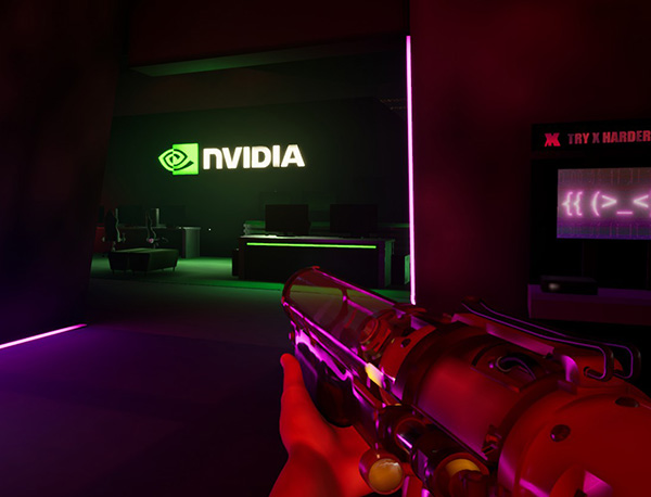
I am 100% sure Nvidia subsidized part of the development of this game to get a featured booth. What a great idea.
As a small indie you can do similar business relationships if your game is interesting enough. I know of several indies who worked with Intel to get free space at the Intel booth on show floors. They also got included in trailers for that technology. Reach out to your IDE (Unity, Gamemaker, Unreal) or to other 3rd-party technology companies that you use to see if they would be willing to partner with you on marketing activities. They can offer money or other promotion opportunities.
However (back to point #2 about friction) the Nvidia booth had like 3 bots patrolling it. I tried to watch the Nvidia video but had to keep turning away to shoot the bots and more than twice they zapped me back to the Carrion booth. If I worked at the Nvidia marketing team I would be calling them today to say “hey we are paying for this, tone it down on the bots around our booth ok?”
Treat your partners like princes.
#4 Always have a call to action
Alright so Devolver spent tens of thousands of dollars on this very ambitious bit of marketing. It was great. But they forgot the crucial component of marketing… a call to action.
Let me explain…
So Devolverland Expo is definitely a tool to get folks from top down to the middle of the funnel. Let’s pretend we are regular old people without any marketing savvy and follow them down the funnel that the Devolverland Expo created…
So you are a gamer who maybe knows Devolver but doesn’t know their latest games. So Devolverland Expo appears on your favorite blogs like this one or this one. Great PR work here.
It was also featured on the front page of Steam and likely got exposed to millions of gamers. So you see it and are intrigued and click the “Download” button on steam. All this is top of the funnel Great work Devolver! I am sure they got millions of impressions on this.
Then once you have installed the game, you are presented with these clear quest logs “get into the building” “explore the Carrion booth.” In typical FPS games this is looked down upon because it breaks “immersion.” But I think it is ok because the goal here is not immersion it is engagement. So I think these quest log items do a good job guiding people down into the funnel.
Devolverland Expo also has achievements that you get for view the booths and finding hidden objects. This is also a great way to guide people down the funnel.
Once you get to the booths you are plunged deep into each game’s setting. It really felt like I was exploring a real convention center. It was great and beautiful. At this point, as a naive gamer, you are transitioning from Awareness to Interest.
Each booth has a giant screen. When you click the “use” button on the screen, there is a full-screen takeover and you now watch the trailer. The trailers are all top notch. The music is great. The action is clear and they are exciting. Very exciting. You, as a gamer, are becoming more and more interested. You want them! Each trailer had a clear release date. Typically within a couple weeks! Yes! You want this!
Then the trailer ended and the full screen went away and you were back to controlling the character. The on-screen-text changes and removes the quest of “explore the Carrion booth” because you at this point “explored” it.
At this moment you are as excited about this game as you will ever be before release. The music, the visuals all blended together to get your heart pumping. It is magic. But then Devolverland Expo wastes this emotional alchemy. They never tell you what to do with this hormonal attraction to that game.
As marketers we know that the most important CTAs in video games are
- Wishlist
- Join our mailing list
- Follow us on social media
(in that order).
Devolverland doesn’t ask us to do any of that.
Yes, I know all gamers should know that if they like an upcoming game on steam they should wishlist it. But, let’s count the steps to do that:
- Tab out of this game. Which the game actually doesn’t allow you to do very easily if you are in full-screen mode.
- Open Steam.
- Type the game’s name into the search bar. Not an easy task for a game with a cryptic spelling like “Olja” or is it “Olija?”
- Then when you find the game, scroll down and click “Wishlist”
- Then scroll down to find the link to their twitter account.
- Click the “Follow” button on twitter.
- Don’t get distracted by the 30 crises currently exploding on twitter at any moment.
- Tab back over to Devolverland Expo game.
- Continue to the next booth.
Repeat those 9 steps for every game in the Expo.
That is too many steps. You probably just continued on to the next booth and the next one and then you did that big boss fight against that giant LCD TV Monster. It was cool but I bet you forgot all the games you saw by the time you beat the game right?
What if after watching each trailer a little door opened and a plinth emerged from the floor with a glowing red button. When you press “use” on it, it opens the steam page for the game you just watched. Then all you have to do is click the “Wishlist” button. The developers don’t even have to open a separate browser because they can embed a browser within the game. Look at this $80 browser plugin for Unity.
At the entrance to each booth there could also be a cool 3D robot you can click and it pulls up an embedded form where you type in your email address. Awesome! Registered for their mailing list without even leaving the game! Devolver could even tag your email based on which booth you entered your email address on so they can be sure to email you when that specific game comes out.
You could even incentivise your mailinglist join. I saw this poster in the Weird West booth:
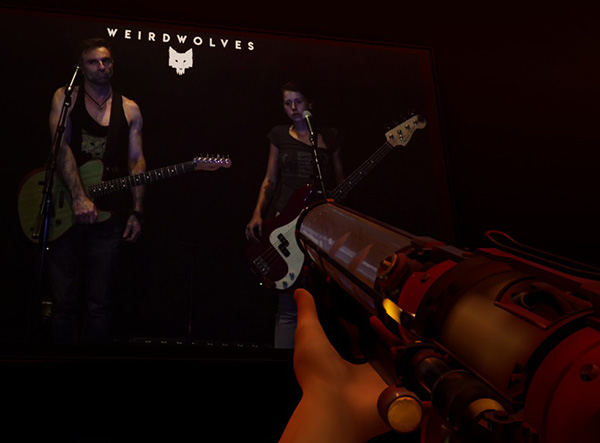
It is for the band Weird Wolves. I think they are the musicians behind the game Weird West. Why not have a little button under this poster that says “want to download the soundtrack?, click this button.” and it opens up an email list entry. You give your email address and they email the Weird West soundtrack.
The game Fall Guys actually got close. The end of their trailer has a call to action “Preorder on Steam… and get an exclusive outfit.” (Side note it is a Gordon Freeman with Headcrab costume) (Side-Side note, the ellipsis are there because they strangely split the CTA between 2 quick screens in the trailer. Weird.)

Anyway, how do I preorder? What button do I push?
What if instead of the 2-Screen CTA, the floor opened and that costume emerged from the floor and I could inspect it in 3D. Right next to it is the glowing button that opens the Steam page with a nice preorder button front and center.
At the very least, after you beat the game, they could have opened a scroll-able list of all the games in the Expo with a nice green button under each that said “wishlist.”
Or they could have ended with an embedded email list signup.
The lack of a clear, direct call to action hurts my heart.
Devolver did so much to put this together. Think of the thousands of dollars and thousands of person hours they spent building this awesome bit of marketing. But the final and most important detail that cements the relationship with the player is missing. Such a missed opportunity.
Repeat with me: ALWAYS HAVE A CALL TO ACTION.
#5 Have a detailed, well communicated strategy defined and shared with everyone on your marketing team
The people who put Devolverland Expo together are top-notch marketers and developers. I am confident that most of them know what a call to action is. However, I think the reason the CTA was not added was because there were so many people involved in this project that not everyone knew the strategy and why it was being done.
The actual Devolverland Expo game was developed by Flying Wild Hog who are the same developers who are making Shadow Warrior 3. (This explains why the SW3 booth was the biggest, most detailed, and most attractive one in the game.)
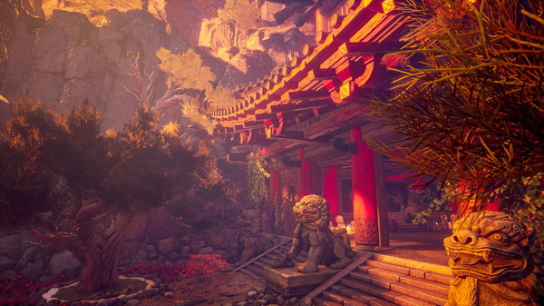
But the Flying Wild Hog developers are probably not marketers. They were focused on the level and game design. Flying Wild Hog is based in Poland and the Devolver team is based in Austin, Texas. There are a lot of very understandable communication hurdles to overcome there. I feel for them.
I bet that the team who engineered and designed the game didn’t know the explicit marketing goals from the marketing and PR team. A typical level designer doesn’t know what a call to action is or how a marketing funnel works. Nor should they.
For this reason, I always recommend that when you have a lot of contractors, or 3rd-party consultants working together, you should develop and share a clear go-to-market strategy that has your campaign’s high level goals and key performance indicators. That plan should be hammered into everyone executing the strategy. From the PR firm, to the trailer editor, to the web developers, to the social and community managers, and even the level designers. A clear strategy will ensure that everyone knows what the call to actions should be and what success looks like.
Final
Even though the Devolverland Expo lacks a clear Call To Action, they are going to be fine. The playable game does an amazing job at getting the feeling of a convention floor right. The games look amazing. They got a lot of press for it. Thousands of gamers have played it. I am sure all the games featured are going to be purchased thousands of times and everyone is going to be rich.
You should look at the Devolverland Expo as an inspiration for creative marketing that allows people to “play” your game before they can play your game. Study this project. Learn from it.
Just don’t forget the fundamentals of marketing while you are doing it.
Thanks Chris, you gave me some ideas for promoting a Kickstarter I’m helping run.