Making a capsule that accurately captures the mood and feeling of your game and yet also attracts players is a very tricky thing. It is my belief that your capsule should be interesting but also should have subtle clues that signal players as to your game’s genre. If you look at the top selling games you will start to see these trends.
Capsules are the most important piece of marketing. It is also the best use of your marketing dollar. DO NOT try to make your own capsule unless you are a professional illustrator. Hire an artist and pay them good money for this. A good capsule will pay for itself. See this post I wrote about the difference a capsule can make.
Every quarter I like to look at the top selling games and see what the latest trends are in capsule design. I don’t think you should make your capsule so unique that nobody has seen anything like it. Instead, you must be in dialog with the best selling game in your genre because chances are the people who buy your game also bought that game.
These capsules came from the game roundups that Valve releases every month. This review covers July, August, and September. Also, you should check out my last quarterly capsule review.
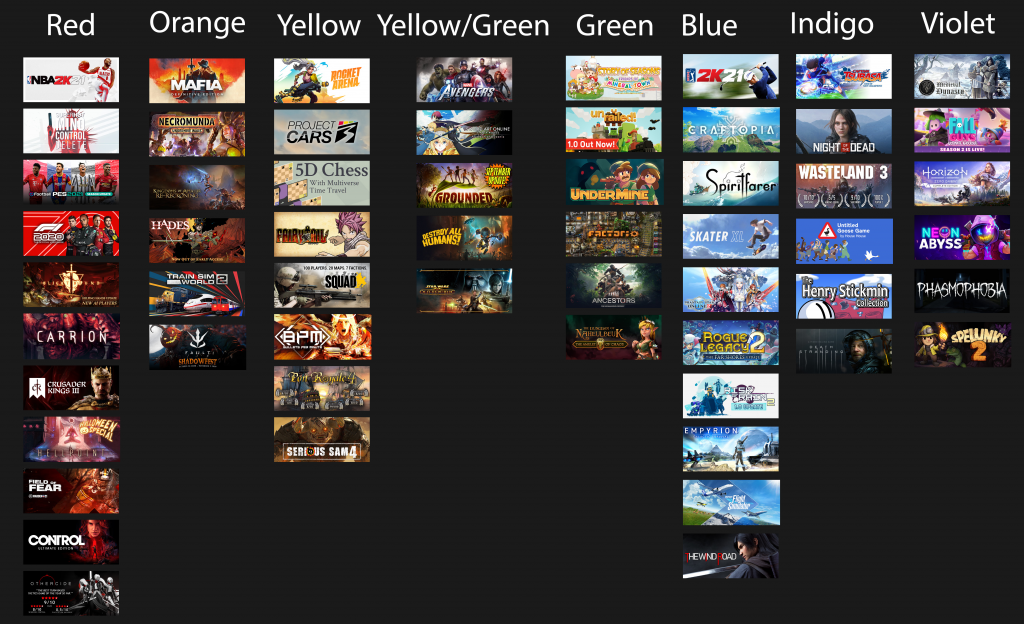
Color trends
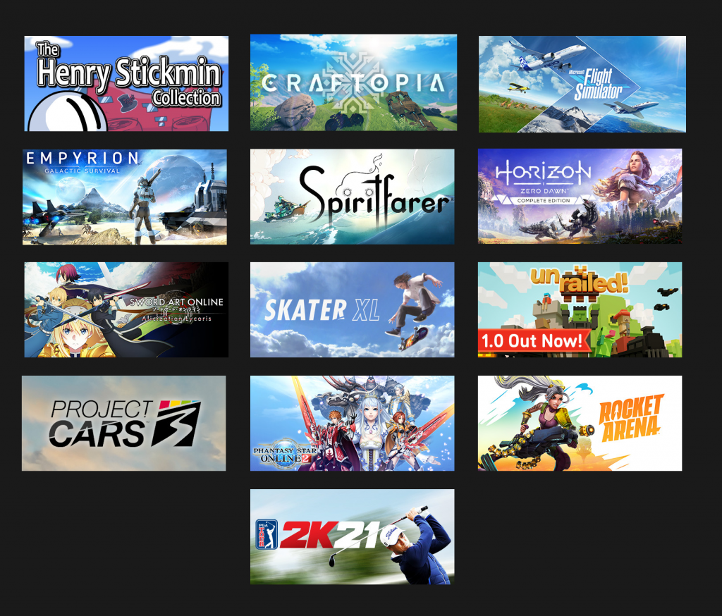
Red and blue continue to be the hot trend in capsule images. Last quarter there were also a lot of Yellow Green. This didn’t seem to dominate as much but it is still a very popular 2-tone combo.
Center text or Left Text?
Two dominant layouts have emerged: Left-Text-Right-Character and Center-Text-Center-Character.
Center-Text-Center-Character.
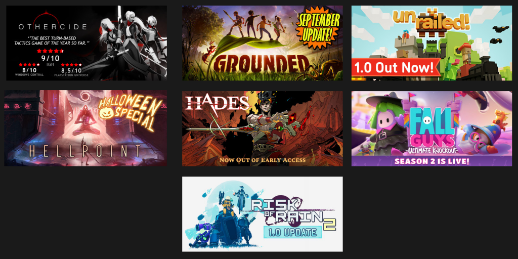
In this layout the text is centered and pinned to the top or the bottom and the character fills in the negative space but is also centered. This variation is used more for games with more complex backgrounds or ensemble characters. For example Grounded and Avengers have more to show off.
Left-Text-Right-Character
I really like this left text, right character layout. The trend focuses on a single, well rendered character, very clear text, and very simple background. All visual emphasis is on the character instead of the more scattered focus of the Center-text layout.
Slight Variation
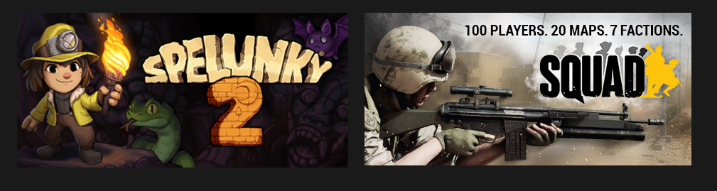
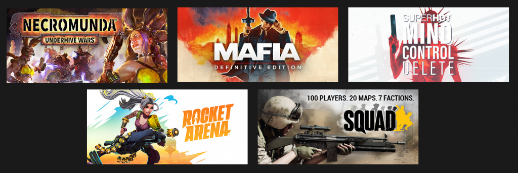
I did notice there were a couple outliers like Spelunky and Squad which mirror the Left-Text-Right-Character design.
Big Skies
Maybe it is the late Summer vibes but a lot of Capsules this quarter feature wide landscapes of white fluffy clouds and blue blue skies. This is actually a neat trick that you can use for cheap Capsule art. If you are making an RPG game and don’t have much budget you can get by with just putting your main character in front of a bunch of cumulus clouds.
Guns Up
In my last review I noticed a trend where if you were making a shooter, show the main character with an angled guns. It seems now it is cool to point your gun straight up at the room or at a firm 90 degrees and shoot the right wall.
Pixelart Games?
A lot of indie devs making pixel art games wonder if they should make their game’s capsule match their games art? Only 2 pixel art games made it into the top seller list (Neon Abyss and Undermine). In both cases they represent their game with cartoonish proportioned characters.
Text on Capsules
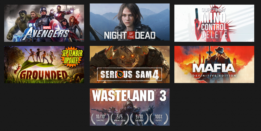
Announcing major releases or special features is always tricky because it takes away from the aesthetics of your capsules. These capsules trend from the overly subtle Hades with almost invisible “Now out of Early Access” to Grounded with its “September Update” which is so loud it seems as if it was inspired from a candy bar announcing “Now With Nuts!”
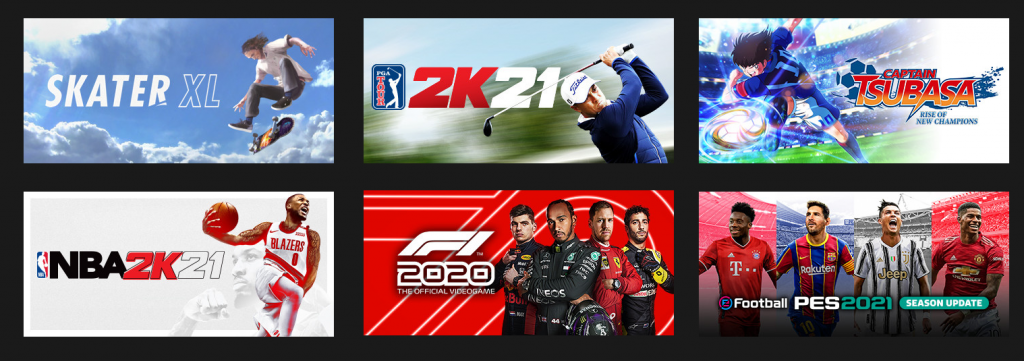
Sports games
Sports games are pretty clear: the star really big, at least upper torso, usually placed on the right side of the capsule, and on a very simple patterned background. Big Clear Text.